
By Kayla Waukau
Marketing Coordinator, Lessiter Media
kwaukau@lessitermedia.com
In my past Marketing Minutes, I’ve focused a lot on social media. I’ve touched on user-generated content, utilizing social media influencers, and more. But do you know the basics of social media design? Follow these simple rules and you’ll be a pro in no time.
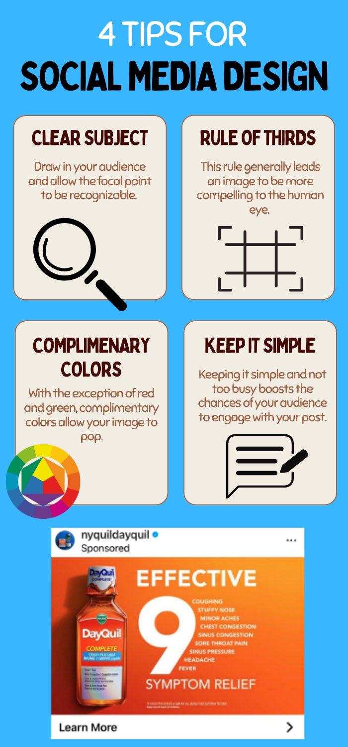
You want to make sure you have a clear subject; something to draw your audience. This can be a single image, a logo, or even a word. This allows your reader to identify what brand it is, or what the post is about, by just scrolling past it.
Just like one of the rules in professional photography, you want to utilize the rule of thirds. The rule of thirds is a guideline that places your subject in the left or right third of an image, leaving the other two-thirds more open. This rule generally leads an image to be more compelling to the human eye.
Choose complimentary colors, this makes the image more appealing and stands out from other posts. However, there is one exception to this rule… avoid red and green! This color combination usually makes viewers think of Christmas so better to just avoid it.
Ultimately, you want to keep it simple. You don’t want an image that’s too busy otherwise there may be a disconnect. It’s important that you follow these guidelines to better execute your social media designs. You’ll find that your social media posts will have more engagement and also increase your brand recognition! Check out my infographic below to see DayQuil’s example that checks all the boxes for social media design.