
 By Dallas Ziebell, dziebell@lessitermedia.com
Marketing Manager, Lessiter Media
The most creatively designed ad, featuring the most uniquely beneficial product, and offering an absolutely killer deal, can still fall flat on its face if it doesn't ultimately prompt its target audience to take some sort of specific action. Seems obvious, but failing to feature a strong "call to action" within a promotional message is a marketing fundamental that many marketers often misfire on.
A call to action (CTA) is the part of your message that tells your audience exactly what to do — and when written effectively — inspires and compels them to do it.
Some common CTAs that you're probably most familiar with include, "learn more," "contact us," or "click here." While these CTAs may cover the action part, they are hardly inspiring or compelling.
With some creative writing and a little introspection into your product's unique selling proposition, you can easily transform even the most boring CTA from ignorable into inspiring. So for this week's Marketing Minute, we share a few clever examples of how marketers have turned common and mundane CTAs into real attention-getters.
Want to play Stump the Marketer? Send me one of your CTAs that you think could really use some improvement, and I'll send back my suggestions for how to tweak and re-position it for greater impact!
Turning the Ignorable Into Inspiring:
4 CTAs That Get Attention!
Exhibit A:
It would be easy to assume that a website CTA is limited only to the actual text featured within a clickable button that triggers movement from one stage of the marketing message to the next. But the most effective web CTAs leverage a powerful, overarching promotional message to drive the audience to WANT take the next step, like clicking a button.
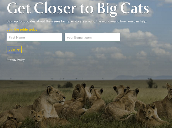
Take this example from Panthera, an organization devoted to the conservation of wild cat species and their landscapes. While the "join" button is hardly a compelling CTA on its own, the CTAs of "Get Closer to Big Cats," and "join the pride today," create a powerful, emotional connection between the organization's mission and the reader's informational interests.
Exhibit B:
Here's some mental Jujitsu that all of you Reverse Psychologists out there will sure appreciate. Instead of the conventional "learn more" approach to CTA, website and development agency, Huemor, cleverly ties together the overall theme of their message with their primary CTA by featuring a button labeled "launch."
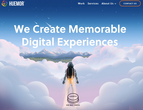
And to arouse curiosity and provoke some daringness out of their audience, Huemor ominously warns the reader, "DO NOT PRESS."
Exhibit C:
Ever find yourself doing some online shopping while wedged deep within the recesses of your couch, when you click "proceed to payment" and immediately reach the dreaded realization that your wallet and credit card is 25 feet across the house?
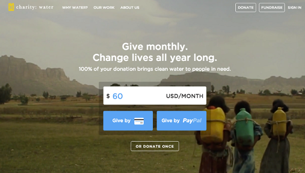
By featuring two different common payment options as part of their CTA, Charity: Water, a non-profit organization that provides drinking water to people in developing nations, reduces the opportunity for shopping cart abandonment caused by user laziness and distraction. Don't have your credit card handy? No problem, just log into your PayPal account!
And a pre-populated payment amount featured within a typeable form field simplifies the entire donation process and plants a subconscious seed in the reader's mind that a $60 donation is the standard contribution.
Exhibit D:
A lot of company websites out there offer users the opportunity to start a free trial. But the CTA on web coding training company Treehouse's website doesn't just say "Start a Free Trial," it says, "Claim Your Free Trial."

The difference in wording may seem subtle, but think about how much more personal "Claim Your Free Trial" is. Plus, the word "claim" suggests it may not be available for long, giving users a sense of urgency to get that free trial while they can.
Sources: Hubspot