
 By Luke Weigel, lweigel@lessitermedia.com
Marketing Manager, Lessiter Media
When I recently heard the first iPhone was released just 12 years ago, my initial thought was "that's it?" The smartphone has become such an integral part of our lives that it's hard to believe not so long ago many of us were still rockin' a flip phone. (And if you still are... rock on!)
While it doesn't have all the bells and whistles (and apps) that many of the smartphones of today are equipped with, the original iPhone and subsequent competitors were a game changer in how we consumed information — a trend that continues to shape how we, as marketers, need to present information to consumers.
Gone are the days of viewing websites primarily on a computer. In fact, according to a recent study by BroadbandSearch, of all web traffic in 2018, over 52% was consumed on a mobile device.
That stat will likely vary for your own website, but you can rest assured knowing a large number of visitors are viewing your site on a smartphone or tablet. Are you setup to be mobile friendly? And perhaps more importantly, is that enough?
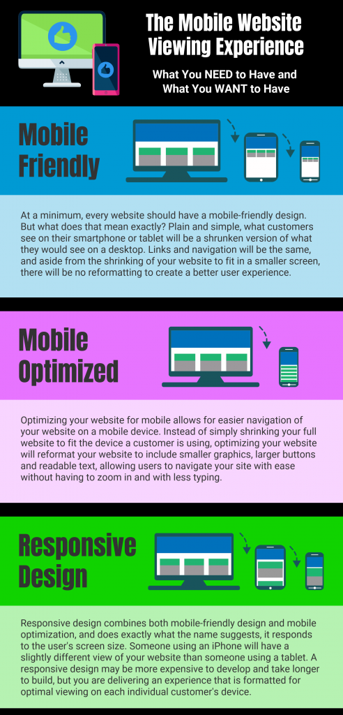
While many hear "mobile friendly" and think of it as a positive, the fact of the matter is that's really just the starting point for a mobile experience, and often times not a pleasant one. Below is a quick guide to help you understand what mobile friendly means, and how taking the next steps to being mobile optimized or having a responsive design will improve user experience.
Not quite sure where you fall on the mobile web experience spectrum? Drop me a line and we'd be happy to take a look at your mobile site and give you some feedback.
Source: Site Ascension